Designing a B2B Marketing Performance Dashboard

An effective digital performance dashboard can help you do something with all that data. Learn how.
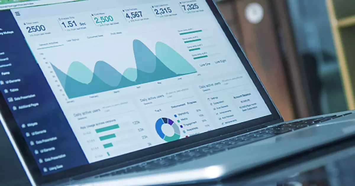
An effective performance dashboard can be the difference between a B2B marketer who is overwhelmed with data or armed with information to succeed. An at-a-glance digital display of the key information needed to achieve objectives, these real-time consolidated data views are an essential asset to monitoring marketing program performance. Marketers who can see what is happening in real-time can gauge progress toward a goal and react to improve things—before it’s too late to recoup lost dollars and opportunities.
Effective dashboards are more than colorful charts and graphs, and they require thoughtful planning and design. While there are many web-based platforms that allow users to create attractive data visualizations, someone must still take the time to consider what the most important information is and how to best present it. If you are new to dashboard planning and aren’t sure where to begin, follow these tips:
Effective Marketing Dashboard Tips
- Establish a clear objective. There are endless types of dashboards ranging from high-level strategic views to detailed analytical deep dives. A dashboard can be designed to provide information about one project, a campaign or an entire marketing program. Every dashboard needs a distinct purpose, so the first step is deciding what you want to communicate and the level of detail needed. Having no focus or clear objective will result in an overwhelming “data puke” (read Avinash Kaushik’s post on dashboard best practices) instead of an effective communication tool.
- Identify the target audience. Who will be using the dashboard to access the information should guide what to include in the display. Just like a B2B marketing campaign, knowing what is important to the target audience is critical to successfully communicating with them. A detailed dashboard for a marketing team trained to know how to interpret the metrics needs a dramatically different design than one intended to provide a top-line view of what’s important to senior management. Whether the dashboard is for you, the CEO, VP of Sales or your B2B marketing agency, understand what the audience wants to know and the level of information needed for them to do something with the data.
- Only include the metrics that matter. In my previous post Measuring B2B Marketing Performance, I emphasized that identifying KPIs comes before the dashboard design. If you don’t have goals and clearly defined metrics/KPIs for your project, program or marketing department, a dashboard is not going to help.
Most marketing dashboards will contain metrics that show present or past program performance based on set goals and the financial impact of marketing’s activities on sales or revenue. When deciding which KPIs (key performance indicators) to include on the dashboard, be selective and only include the most important metrics. Once a window into performance data is open, it can be tempting to include too much information and visual variations. A dashboard should be comprehensive but not overwhelming—if it tries to do too much, it may be cluttered, hard-to-decipher and ignored.
- Keep it realistic and in real time. Out-of-date or inaccurate dashboards aren’t just a barrier to user adoption; they can result in bad decision-making. It’s better to cut back on data integrations than have poorly maintained displays. Don’t take on too much, and focus on displaying only reliable, real-time results. Also, your dashboard doesn’t have to answer every single question, so don’t let the inability to integrate with a CRM or other system or lack of access permission from Joe in IT be a stopping point from doing anything.
- Make it actionable. An effective dashboard does more than display data; it leads to recommendations and reactions. Users of the dashboard should be able to easily understand the data relevant to the goals and determine next steps or actions to take. Good dashboards lead to good decisions.
While a performance dashboard won’t eliminate the necessary work of setting goals and analyzing results, it can help organizations to spend less time finding data and more time doing something with it. The best dashboards provide insight, facilitate understanding and ultimately prompt action toward constant improvement.
For more on this topic, including interface design considerations, read more in our UX Booth article, Performance Dashboard Design: How to Put Data to Work.
Godfrey Team
Godfrey helps complex B2B industries tell their stories in ways that delight their customers.


