4 lessons B2B exhibitors can learn from CES 2016

The biggest “consumer” show is more B2B than you think. Here’s the best event marketing inspiration we found at CES this year.
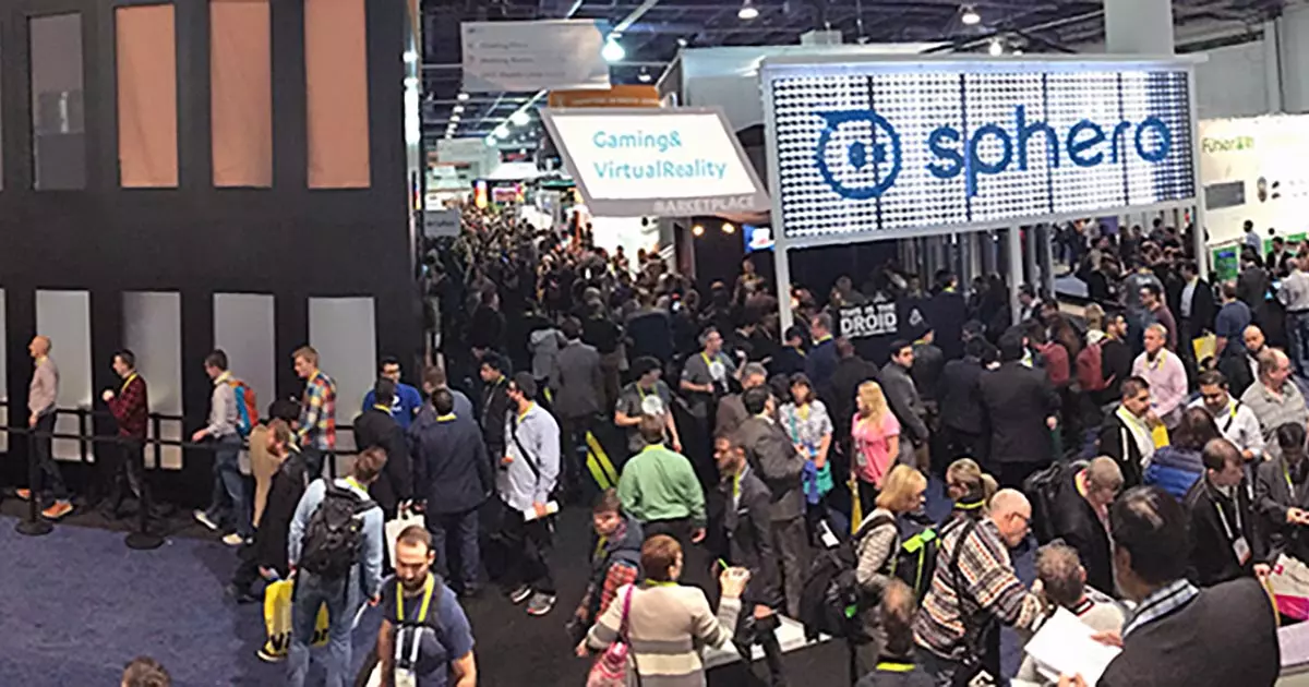
It started as “The Consumer Electronics Show,” but you could argue that CES has become one of the most important B2B events of the year. Because even the brands promoting consumer products are really there to meet distributors, potential corporate buyers and major media outlets. And many brands in attendance aren’t consumer-focused at all, with quite a few pure-B2B players in attendance. (I came with one of our B2B clients this year.)
So, from a creative point of view, what CES inspiration can B2B marketers take to their next industry tradeshow?
1. Let your product in on the fun.

Bosch showed up with one of the event’s most unapologetically B2B-focused booths, even dedicating a large section to their work in the industrial Internet of Things (or “Industry 4.0”).
But Bosch didn’t just bring a bunch of pretty graphics. To showcase an industry robot system safe enough to share the job floor with human workers, Bosch employed their “APAS assistant” as a robotic barista. This helped draw a crowd while pointedly demonstrating the product’s key advantage.
2. You can do better than those two LCD screens.
It’s pretty common for B2B marketers to loop a corporate video somewhere in their trade show booth. Brands at CES do this, too. The only difference is that the best exhibitors at CES thought quite literally outside the box when it came to their video displays.
Qualcomm, for example, used a long, horizontal display to usher attendees into their colorful two-story space.
Intel covered the front of a restaurant with their dynamic content. How many of your corporate presentations have a door in the middle of the frame?
And Panasonic used projection mapping to turn a three-dimensional globe into a display for their motion graphic video.
3. Build an experience, not a booth.
The booths that made the greatest impact usually weren’t booths at all. Not in the traditional sense, at least. These were spaces where the brand understood their presence at the show as an opportunity to connect their audience with a single message or idea. They were confident enough to shuck off many of the standard trade show fixtures to make room for a focused, unified experience.
Krush offers a suite of apps that leverage emotional recognition technology, but they wanted to use CES to talk about their broader mission: “…Creating a more perfect union between humans and machine.” To do this, they showcased a moonshot concept product that blended a VR-headset display with a free-motion simulator pod called “Moveo.”
Krush isn’t selling Moveo anytime soon, but they centered their entire hyper-minimalist design around Moveo because of how this invention expressed their corporate MO. This was one of the simplest designs I encountered at CES, and yet it was one of the most memorable.

Oculus is the biggest name in virtual reality hardware. It goes without saying that firsthand experience is central to their brand value. So Oculus used their entire booth as a staging ground for single-serve product demos. You couldn’t even step into the structure without waiting in line – and often that would take even more than an hour.

Once inside, the booth was soft-lit and simple, like the Apple Store on night-mode. Plenty of support staff walked the floor to help facilitate the experience.

Audi came to CES touting its vision for the future of transportation. And so they designed their space as an otherworldly experience. Half trade show display, half art installation, the Audi exhibit was a staggering arrangement of mirrored beams and colored lights.
All of it served as an elaborate frame for Audi’s electric and piloted cars of the future.
4. Take your concept as far as it will go.
We hear it from our B2B clients all the time: In a trade show setting, you want your branded space to stand out, to make an impression, to “pop.” The surest path to this kind of remarkability is to define your message, articulate your creative concept and then chase that concept as far as it will take you. It will lead you away from the pack every time.

As a brand concept, OtterBox is all about security. Their product, after all, is designed to cushion, seal and otherwise protect an electronic device from harm. Their booth space channeled that feeling of security into a consistent aesthetic, complete with warm tones, plush carpeting and cozy seating arrangements.

Klipsch is a premium speaker brand with deep roots in the Hi-Fi movement. They captured their quality tradition with a booth style that was decidedly rustic. In the planning phase, this might have been a scary proposition, to dress old-fashioned for the year’s biggest innovation show. But that was precisely how Klipsch managed to “pop” from every other booth in its vicinity.
From Bosch’s caffeinated product demo to Audi’s deconstructed booth design, CES 2016 had plenty of inspiration for B2B marketers to take into their next round of trade show planning. Sure, your technology may be more complex and your budget may be less expansive, but you can still make a surprising impact if you keep your eyes on the concept.
Godfrey Team
Godfrey helps complex B2B industries tell their stories in ways that delight their customers.


